
recent art, recent history adelaide installation
This article covers a group of shows, but it also means to be an overview of some recent Adelaide art, all of it installation. To exhibitions by Matthew Bradley, Sarah CrowEST and Nic Folland I have added others, as kindred, similar, coming out of like streams of influence. I have also cast back to earlier exhibitions by these same artists–to see the trajectory of their art so far. Nic Folland has been showing longest allowing the possibility of being able to suggest a generational difference here. That would be good, some sort of voice says: it would mark ‘progress’, wouldn’t it?

This, then, is one of those “notes towards a definition” style of pieces. The headings under which the artists might be discussed and in relation to which they can be differentiated include simulation, literalism, kitsch and popular culture/the sub-cultural, and, almost tacitly, the irony that is fairly pervasive in Adelaide art.
Sarah CrowEST’s most recent exhibition Get rid of yourself! NOW! manifested at the Experimental Art Foundation (August 26 — September 24, 2005), sharing the space with Matthew Bradley’s The Weet-Bix Kid. CrowEST showed a sequence of filmed performances in a darkened room discrete from the open gallery. In that open area were some groups of her recently made ‘cute alien’ dolls. To call them dolls though misses the central point, that they seem alive and ‘souled’, to have lives, egos, identities and, often, a ‘plight’: the viewer can feel mutely addressed or appealed to. As well as possessing seeming wills and desires, their presence seems subtly but distinctly bodily: they have, variously, nipples, suggestions of pubic hair, folds and creases that suggest ongoing process, desire and appetite, and which produce mildly comic or embarrassing (‘abject’ is the word one wants to avoid, though it applies) spills and leakages. (These last appear, as the merest traces, on the walls beneath them or fallen to the gallery floor, and sometimes as dribbles on their own person.)
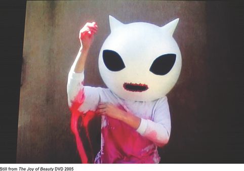
CrowEST’s projection-pieces employ a development of strategies worked up through sorties into the performance area over the last few years. Those in Get Rid Of Yourself deal with body-image and with anxieties as to beauty, attractiveness, acceptability. While it does make the viewer uneasy, the work is mostly comic and disburdened of ideological critique. The alien featured is an ice-cream-white head (worn by the artist and balooning far beyond her own shoulders), with dramatically wide-set and elegant eyes, tiny mouth, no nose: a stylization that makes the character cute, feminized and childlike, or cute-ly child-like.
Seeing such an irresistible ‘alien’ disfiguring itself in an effort to ‘join the club’ could be rather disheartening, painful even. The short, filmed performances are content, though, to stress the humour of the situations, the irrationality we have all shared at some time. Many of the short treatments register the camera-person’s voice-over urggh! as final comment. Distressed at its self-image, the creature is driven, helpless not to go on, in a frenzy of self-punishment and self-mutilation. CrowEST here uses a glamour that ‘stands for’ human beauty or normalcy (without resembling it).
Mounted in constellations on the wall, the exhibited objects are intended to look as though they are making self-presentations, are consciously ‘on display’, attempting to put their best aspects to the fore (and to hide others). They are meant to seem self-conscious, therefore—and not simply guileless and straightforward. (That is, they are sufficiently formed psychically to be able to be selfconscious.) Of course this is not a position of strength—passivity before the anticipated or invited gaze: one is to be judged, after all, and is vulnerable. The spectator sees this and feels unwilling to be the judge: the power is incriminating, makes the viewer uneasy. It is an interesting effect, especially given their artificiality.
Sarah CrowEST’s work has for some time manifested as a preoccupation with the Other, the alien, figuring it as bodily presence and as another subjectivity weighted equally with the spectator’s. A CrowEST exhibition of some years ago (Downtown gallery, End Of Roll Approaching, 2003) showed vaguely sugar-almond shapes, ranging from about a foot or so to maybe fifteen centimetres in height. These were housed in chains of adjoining cubicles that the viewer stood over to peer into from above. Imprisoned within, these figures were variously seen to be sleeping, bored or in despair; numbly ‘seated’, curled in corners; or trying to scale the walls—to escape or join others. Some, like pet animals (gerbils, guinea pigs) had pooed their cages. The work risked being cute you would think, hearing it described, but it was not. The sense it gave off was of enormous ennui and frustration—creatures literally ‘climbing the walls’—of time dragging slowly, of tragedy. The viewer was able to smile at the creatures’ cuteness—but their pain censured this. One felt great sympathy. And perhaps the ‘cuteness’ stood in for the ‘colourful charm’ often attributed to other cultures: CrowEST here had us attribute it and see that we had done so, caught out as patronising, smugly dehumanising—or able, anyway, to see the reflex that way and move beyond it. Her performance manifestations likewise mobilise categories of other and like, are amusingly ‘weird’—yet call forth empathy, an ethical, imaginative identification with the Other.
Matthew Bradley’s The Weet-Bix Kid employed some very skilled mise en scene installation work (graffitied work-site scaffolding, one piece being not just technically a painting but suggesting that Bradley, if he chose, could almost make a career move in that direction) which worked to demarcate his space in the gallery and suggest some ambient parameters or context to the real work. This ‘real work’ was the projection of a looped sequence of CDRom ‘documentations’. These concerned a boyish aesthetic of romantic risk-taking: the climbing of a tower, a model car speeding down a ramp and jumping, footage of aeroplanes coming in to land. The last had been shown before at a Downtown gallery some time ago. It was good then, though it benefitted this time round from being projected as large as it was at the EAF. Some years earlier Bradley showed kindred footage at The Festival Centre’s Artspace—film taken of the city at night (or dusk-shading-into-night) taken from a plane hired to fly him in a circuit around Adelaide—again, with a tiny but effectively anchoring touch of installation: some blue fluoro placed in the gallery, that appeared also in the film, but affirmed that, yes, this was here, right where the viewer was. (In fact the Festival Complex was one of the features the film took in. It seemed a sort of paean to Adelaide.)
The aesthetic payoff The Weet-Bix Kid pieces deliver is in the isolation and distillation–the ‘realisation’, perhaps—of the sort of thrill that could be thought to inspire such activities in the first place. The film of tower-climbing is a seemingly straightforward documentation of effort and of a task begun and accomplished. (It resembled much sixties Conceptual art, in that the activity documented is simple, has no symbolic or expressive import, the camera work is perfunctory.) Bradley takes pains to allow the viewer imaginatively into the work. The camera shows but the slightest glimpses of the climber: a hand occasionally reaches to a rung: mostly the camera records the slightly vertiginous upward progress, sways with the effort of climbing, rung by rung. At more or less regular intervals—probably those constituting a ‘breather’ for the climbing artist—progress is registered with a scan of the horizon. Suburban roofs get smaller, we have moved beyond cyclone-wire mesh fencing, we can see better into more yards, trees fall further and further below. It becomes our climb. The final expansive pan from the top of the tower (a lighting tower at the edge of some oval in an undistinguished suburb) is like a reward and an attainment: the sky of dawn (or is it dusk?); the workaday world well below, in another sphere, transformed; an aeroplane dropping through the sky as it comes in to land. Is the focus a little blurred?—the effect anyway is of dreamy elation.
If the other footage of planes coming in is connected it might be via association with similar teenage yearning after large, undiluted aesthetic experience—that is, trips to lie under descending aeroplanes. (Bradley hasn’t dealt so far with the railways.) This footage carries less direct reference to the positioning of the viewer. In fact it is projected upside down and maybe backwards. It is a simply achieved alienation effect—and, while we do realise these are planes, this device allows us to look at the strangely shaped objects as ‘unknowns’: eventually some planes seem designed to be flown that way. The filming in this projection is a little more manipulated: focus drops in and out, the pacing seems slowed, planes become balls of fiery or gleaming light rather than being always recognisable as planes: one might be (again, dreamily) playing distractedly with the flaw in a window’s glass, or with effects caused by adjusting a camera’s focus, from sharp to diffuse and on to dissolution. The ideal seems to be moments of forgetfulness, of bodiless identification with a scene and its repetition, or with the stasis of repetition.
A comic turn separates these two films. That is the (filmed) rush of a small yellow model car down a long prepared ramp and then up to a sudden jump. The car is frozen in mid air. An hilarious bit of derring-do. Amusing and loveable, it sits as an irony between the other films.
The artists mentioned here are mostly of a generation. Nicholas Folland either straddles two generations—that of the late 80s/early 90s crop (Bronwyn Platten, Shaun Kirby, Craige Andrae, Andrew Petrusevics, John Barbour, Richard Grayson, Aldo Iacobelli, Paul Hewson, Linda Marie Walker, Alan Cruickshank, Simryn Gill, Mehmet Adil, Annette Bezor, Anton Hart, George Popperwell) and the group who began to show ‘this century’, as we can now begin to say.
A long period? There was room for a crop midway between—and contenders did produce and show—but the scene had ceased to fire: energy and money were running down, a critical cohesiveness was no longer so evident amongst the artists or their curators. To me it seems a failure of Adelaide to support interesting art. Of the names listed above only a few have managed successful ‘mid-careers’—not for want of producing the goods; and of those who have, almost all had to leave Adelaide, either permanently or regularly, to do so. This may merely be a function of Adelaide’s small size. More good artists than the town could handle was a luxury at the time–though the broader public missed out—and with so many ageing hotshots clogging up those ‘galleries for the new’, where they were confined, the youngsters snapping at their heels snapped in vain: less able to get shows and judged against a vastly raised bar when they did. When I say critical cohesiveness was less in evidence I may not be entirely correct: the then newer generation were pretty theory-driven, and their impatience with the work of the slightly older crowd gave them definition. (The scene now looks much less enamoured of ideas or animated by them. ‘Dumbed-down’ would be the fatal expression, wouldn’t it? And it would not be entirely fair to the work which succeeds.)
Are observations like these maybe slightly ‘idle’? They can’t be verified. As well, judgements as to the success or failure of whole nascent careers sound cruel and are equally unverifiable (except as measured by exhibition and critical column inches); and so on. (Some people from this middle era have survived: Louise Haselton, Michelle Nikou, Paul Hoban, for example, but all three are independents.)
Bradley and CrowEST are part of a more recent group. Folland would seem to have come late in the time of that professionally failing (though often aesthetically interesting) mid 90s group and by virtue of his success can seem either to stand alone or to be written in to the still earlier push, as part of its late, long tail.
Folland’s various modes relate more to those of the earlier ‘A’ team. George Popperwell is usually thought the eminence grise—the primo grigio—of one stream within this now greying generation. His practice is the methodical development of intuitively chosen and privately resonant idea and theme, and the bold elaboration of their metaphorical and allegorical equivalences: mystery and deliberation, then, as is the manner also of Kirby, Platten, Hart. There is something of this in Nick Folland.
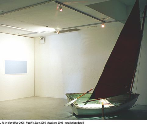
Folland’s recent exhibition, Doldrum (Experimentasl Art Foundation, Oct 7—No 5), consisted of two equal and complementary strong notes: installation pieces. There were also some gridded sheets with no feature added (indicating trackless ocean, I guess) and, on the entrance wall, a sort of rearing dragon shape made by reconfiguring—as if through weird continental drift—the land masses of various continents into that overall, disconcerting shape. But (as with Bradley’s scene-setting) these elements were mere framing support to the two central pieces.
One entered the space to see a small sailing boat, a real one, in mid gallery, listing slightly, its sail slack. The boat was filled with a watery wash of glass plates, dinner bowls, fruit bowls, desert plates—all in cut glass. It seemed a melancholy, slightly drunken metaphor for tragedy, for standards slipping, things ‘going to the dogs’, sliding out of control. Plates and fancy glassware surely standing for civilized standards, domestic capital of a kind, perhaps even niceties of behaviour, a tearful nostalgia. An eerie light rose from within the boat, through the plates. Of course, the boat was ‘funny’, too.
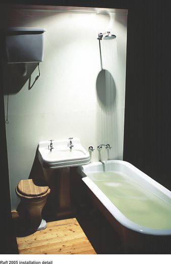
To left was a room with curtained entrance. Pushing this open, one was struck by the sight of a real, life-sized bathroom (bath, shower, sink, wooden floorboards), all of which was tipped at a severe level (as if in a sinking ship, perhaps, or a flood or landslide). Water was pouring at a furious pace from taps and shower and overflowing, partially flooding the floor. The scene is quite startling: brilliantly lit within a confined dark space, it creates a sense of panic and claustrophobia: it is directly opposite the scene outside which takes place in an oceanic–and becalmed—vastly open space, of helplessness and lassitude. This interior scene was more like a disaster taking place. The noise of rushing water, though, did transfer some urgency to the ship outside.
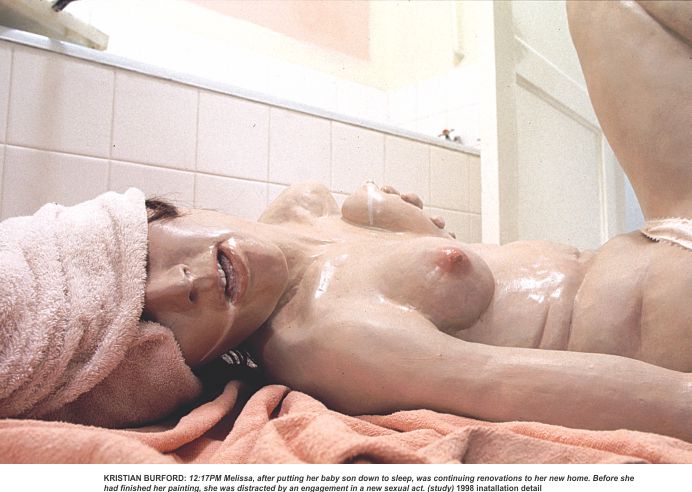
How do these bodies of work compare with each other, and with other work done here and outside Adelaide? Folland’s work bears comparison, on differing grounds, with Popperwell and Hart’s—as a sort of interventionist, startling alteration of the space—but also with that of Kristian Burford and others, as simulation. The poetic behind his work is probably something more like Harts’s and Popperwell’s (and Platten’s, Kirby’s, Barbour’s et al)—around metaphor or image and allegory. Artists might be divided into significant ‘image-makers’ (whose work gathers meaning from the situation that it is attune to) and work which is more extendedly propositional, pushing ‘ideas’. Folland’s seems closer to the former. He has themes, consistencies, sure. But the works seem to seek resolution/realisation of a nexus of meanings and has less of the depth one looks for in, say, Kirby or Barbour, Platten or Hart. ‘Depth isn’t all’, let me point out. Doldrum’s illusionistic aspect it shares with Burford and Bianca Barling and Andrew Best. The latter trio might be thought to deal in, and with, genre: modern Gothic, melodrama and kitsch, urban myth (and there is an element of this last in Bradley’s work, too, and in James Dodd’s). In contrast, Folland’s imagery, and the codes it suggests and allows, are both less tightly set by the work and less narrowly defined as a sub-cultural or niche style. On a bad day these artists’ work can have too much the air of side-show alley, in my view.

Folland’s Doldrum possessed the gallery space fully. Exhibitions in Adelaide have for some years now often tended to be too small, wasting the opportunity to make large bodies of work known. It may reflect a lack of confidence. This may reflect the lack of venues—that is, given the unlikelihood of being shown, artists think ahead to specific works but not to the idea of exhibition. Exhibitions become, then, progress reports. But even quite established artists have, irritatingly, from time to time, opted for showing precious little.
None of the exhibitions under discussion were niggardly, though CrowEST’s was basically just two discrete, small bodies of work. Bradley’s installation effects mostly served to demarcate his space and create an area in which to show what were film pieces. Folland’s work was spare but had dramatic presence sufficient to the gallery and did feel, just, like a whole show. (I realise that is not a term that allows of definition.) In any case, I think it was a reflection of his greater experience of exhibition. (One has seen too many boats in art galleries, usually as mawkish symbol-of-the-soul. Folland’s Doldrum wrenched the signifier far enough from that to escape the cliché that threatened. Another mark of his experience.)
An obvious comparison to make with Bradley’s endeavour is with that of Sydney artist Shaun Gladwell. Bradley’s work acknowledges—and disarms—a response to itself as ‘romantic’ in a way that Gladwell’s seemed unable to do with its David Lean, wide-screen production values and conventionally dramatic focus (on the figure of the skateboarder heroically vertical against a storm-laden horizon). Gladwell shows unbroken takes from a fixed camera point. In kindred spirit Bradley’s work is from hand-held or simply strapped-on camera and seems not heavily edited. Where Gladwell would have an old-style sublimity transfer to (and thereby validate) a youth-culture activity and, perhaps, its attendant state of mind, Bradley’s work is more continuous with the 60s aesthetic of literalist demonstration that would have us remain aware of process and deduce and verify the enactment’s itinerary or goal. Gladwell’s work is less linear, more static: it presents a kind of capital ‘B’ beauty as its end and would have the viewer fully under its spell. Bradley’s ‘beauty’ is less clearly of capital B status. It is offered as such, but with a deal of irony. I’m up for either work, but the ‘realism’ of Bradley’s foregrounded process makes the work mean more to me. Bradley’s literalism might be something he shares with others in Adelaide: with Yoko Kujo’s filmed works, with Mark Siebert’s recent photographs (Downtown Gallery, September 2005) of ‘punished theory’: PoMo books burnt, axed, garrotted; and with the Peter McKay work also shown at Downtown this year. If it is a 60s, Ed Ruscha aesthetic then this would see these artists linked with others amongst the earlier set—not the Popperwell/Kirby impulse but the moves associated with Richard Grayson, Paul Hewson, Linda Marie Walker, Craige Andrae et al.
Kitsch and Simulation
CrowEST distills a kitsch style rather than simply quoting an available one or quoting specific objects of popular kitsch. It is a saving grace that insulates her work from most of the criticism that kistch calls down upon itself. Her objects have a fleshed-out modus vivendi. They live, sweat, burp, have desires, experience time, embarrassment, self-consciousness etc. The transposition of these things, of the physicality in particular, by cute stylization, draws attention to them—though they are only subtly apparent. It draws attention to them because these are things kitsch is most often employed to disguise or occlude. If CrowEST’s work were to take the direction of more extensively elaborated worlds it might draw comparisons with that of Henry Darger and the stylizations of artists such as Haluk AkarkÇe, Chiho Aoshima and others—perhaps an unwarranted speculation.
Kitsch has featured in Bianca Barling’s work before and could be said to be an element in Andrew Best’s show Paradise (E.A.F., 2003). As well, simulation was a tactic both artists have employed. Other artists who work, one way or another, close to this twinned problematic are Kristian Burford, Mimi Kelly and Clint Woodger, and Tim Sterling. Sam Small produced an interesting body of photographic work whose simulated interiors elucidated something about the real scenes (‘filmic’, I thought) that they evoked—narrative implications of story type, of mood and style. Deborah Paauwe, too, might be considered here.
Fascination with kitsch has always been around, not confined to Adelaide. The problem with it is that its joke is always too mild, and too easy and always already long-received. Everybody regards it as either slightly funny or irritating and feels superior to it. Usually the art seems only to invite the audience to join the artist in agreeing that, Yes, here again, in this instance too, the kitsch object is foolishly undercut through the fault of its own stylisation, exaggeration, and bad judgement as to the rhetoric it attempts to operate. Kitsch is only interesting (and barely, at that) as symptom, as nervous pathology: what does it hide, suppress or disguise is the only possible interest—beyond awful fascination.
Greenberg’s famous ‘Avant-Garde and Kitsch’ gave the severe modernist take: that, on the one hand, kitsch gave a distillation of the ‘ends’ of art (i.e., beauty, as conventionally supposed, sunsets and the like); on the other, the avant-garde (i.e., real art) analysed and further refined the ‘means’ of art (that is, stylistic procedures and premises—as seen in the sequence of increasing abstraction, Abstract Expressionism, the post-painterly and so on). A strong, avant-gardist form of this opinion has it that most of the work in most commercial galleries at any one time is likely to be kitsch rather than art. A similarly wielded distinction would have it that most of that which calls itself art at any one time is craft. Too severe? Don’t worry, the ironies it is supposed the postmodern makes available can mean, of course, that kitsch can be held in protective gloves or pincers, framed for examination by this second or third degree removal. Which removes us from the problem. Close call! I can hear atist and theorist Michael Newall say. One can’t have much time for it otherwise. Literalism
Consider the literal presentation in Bradley’s work, literalism about activity that is both actual and symbolic. In CrowEST’s there is literalism in the straightforward documentary manner of her films, the undisguised fictionality of the mask or costume the artist wears. (We might remember here Richard Grayson’s filmed walks-with-commentary; the endless line-up of books knocked over serially as the camera approached and bumped them; his recent Country and Western Messiah music clip CACSA, 2005.) Folland’s work is clearly metaphorical if not allegorical. It is not literalist. But it, too, is simply presented and makes no extended proposition: it simply radiates and absorbs readings or meanings—a fit vehicle for our anxieties and thinking about very present uncertainty (as to shifting geopolitics, globalism, the environment, tottering and awakening empires).
Bianca Barling has hitherto fit within this nexus of critical issues and attitudes. Earlier work of hers at the CAC was a simulationist installation that dealt with romantic melodrama. Her filmed work, as seen at Downtown in 2003, had some of the objectvity-focused-on-sentiment that characterizes much of, say, Fassbinder. As I write, her Electric Ladyland has opened (at the EAF, November 18—December 17). Briefly: it comprised a complex set of three parts—the first a pyramid of champagne glasses & a sculpture, in ice, of a swan, beside which an attractive young woman stood in fishnet stockings, French maid’s ultra short skirt & choker, pouring pink champagne. Opposite was a large round pouf about two foot high, covered in rusched gold material on which lay two young women, asleep, seemingly drugged. They were dressed as were the women in a long, very slow, looped film that was projected at the same time—of a young woman (sometimes in lingerie, at other times in an oriental cheongsam-styled dress, smoking opium & passinng out. The third element was a line of lettering: made of metallic gold, helium-filled ballons & spelling out PAIN IS A GIFT. There was a melancholy soundtrack. No narrative was told or played out, so we can take it that the work meant to isolate or distill the conventions that constructed the dangerously attractive femme-fatale and, empowered by this amour beauty (constructed—but ‘self-constructed’?) to flirt with narcissism and self-pity. It is not clear to me that this isn’t all ‘old news’, but it was suavely delivered. Even so, it would be hard to argue that it was able to propose a great deal: its work was mostly to isolate a nexus of themes, a subject area.
Ken Bolton is a poet, critic and publisher—author of the study, Michelle Nikou (Wakefield Press, 2005), and of many books of poetry—the most recent being Europe (Little Esther Books)
This article covers a group of shows, but it also means to be an overview of some recent Adelaide art, all of it installation. To exhibitions by Matthew Bradley, Sarah CrowEST and Nic Folland I have added others, as kindred, similar, coming out of like streams of influence. I have also cast back to earlier…